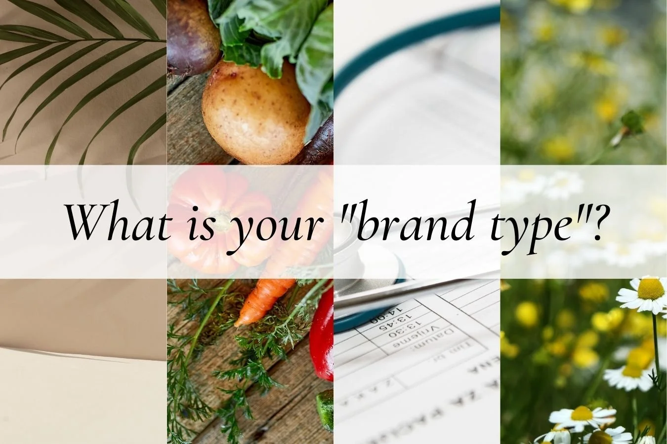
What does your branding communicate about your practice?

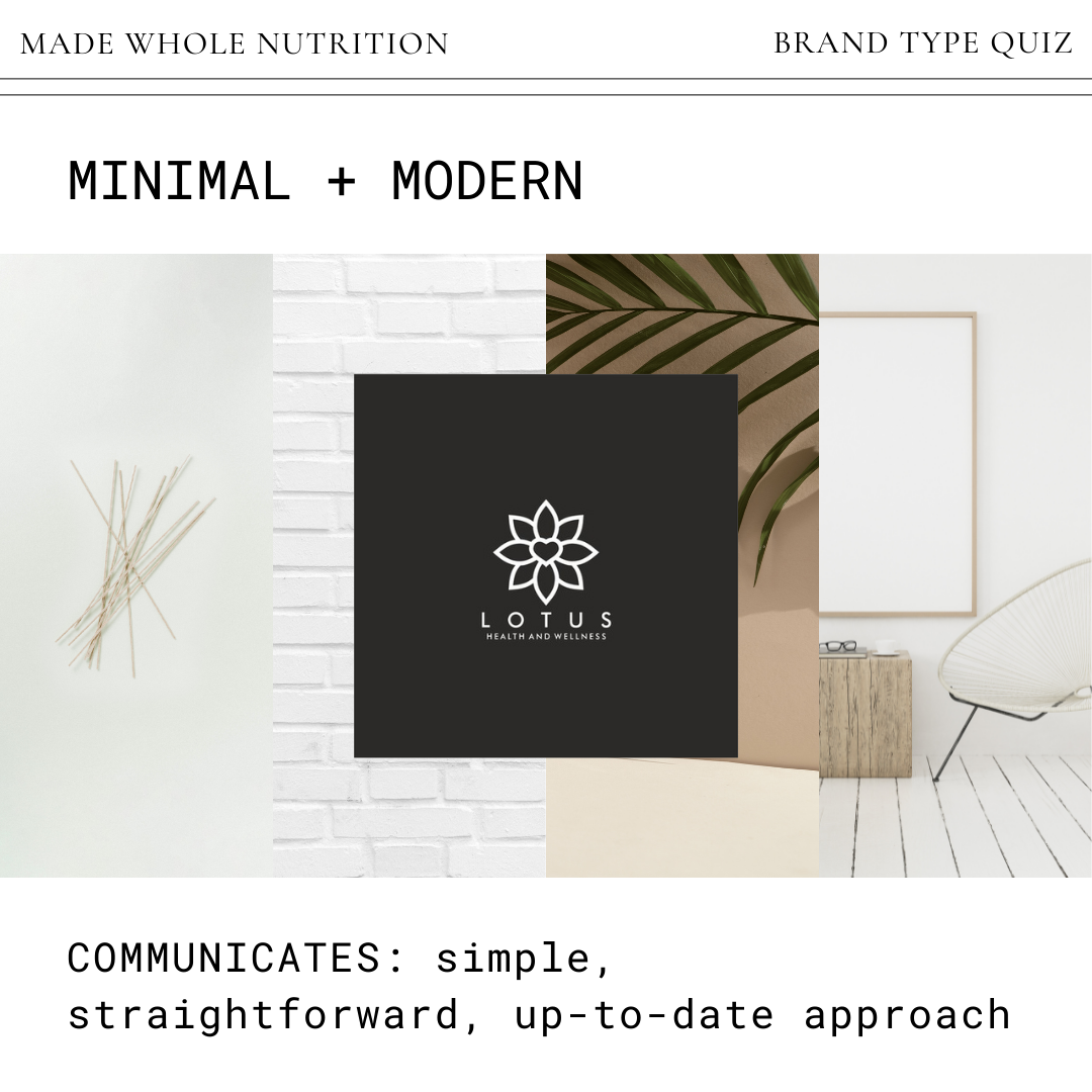
MINIMAL + MODERN
colors: probably black and white (make sure to choose a single accent color on your brand board for personality)
elements: clean, thin lines, simple shapes
font: clean, probably sans serif (adjust letter spacing on Canva for more interest in your logo text)
best for: a practice that is focused on working with professionals or millennials
pros: communicates that your approach is simple, straightforward, and up-to-date
cons: may be confused for a spa or graphic design service
how to set apart: ensure your logo contains a word that indicates what you offer (wellness, nutritional therapy, functional health, etc)
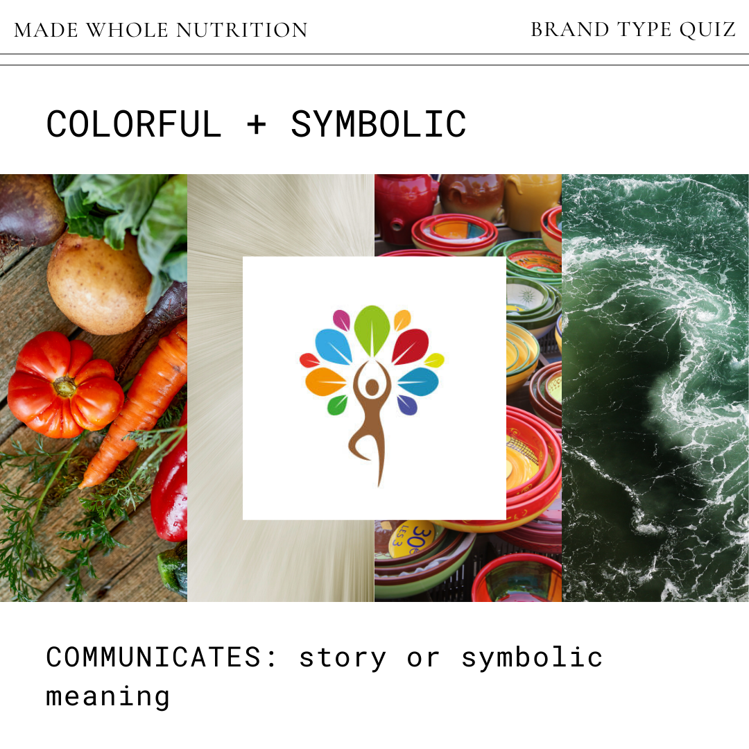
COLORFUL + SYMBOLIC
colors: bright colors (perhaps narrow down to 2 or 3 so not overwhelming)
elements: lots of movement and detail
font: playful and interesting
best for: a practice driven by a passionate practitioner
pros: often communicates a story or symbolic meaning
cons: can look haphazard to someone who doesn’t understand the meaning
how to set apart: there is nothing wrong with an intricate/symbolic logo, but create 2 versions (one with words and one without) for applications where you don’t want it to look too “busy”
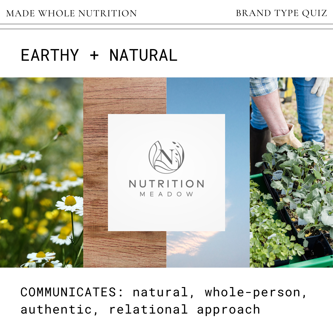
EARTHY + NATURAL
colors: green, browns, earth tones
elements: something from nature (leaf, branch, carrot, etc)
font: can be anything, but best to keep it clean
best for: a health practice that focuses on holistic healing
pros: communicates a natural, whole-person, authentic, relational approach
cons: can look too artsy or "homegrown"
how to set apart: remember that in addition to your natural approach, you are also a professional (so make sure your logo communicates that with a clean, modern font)
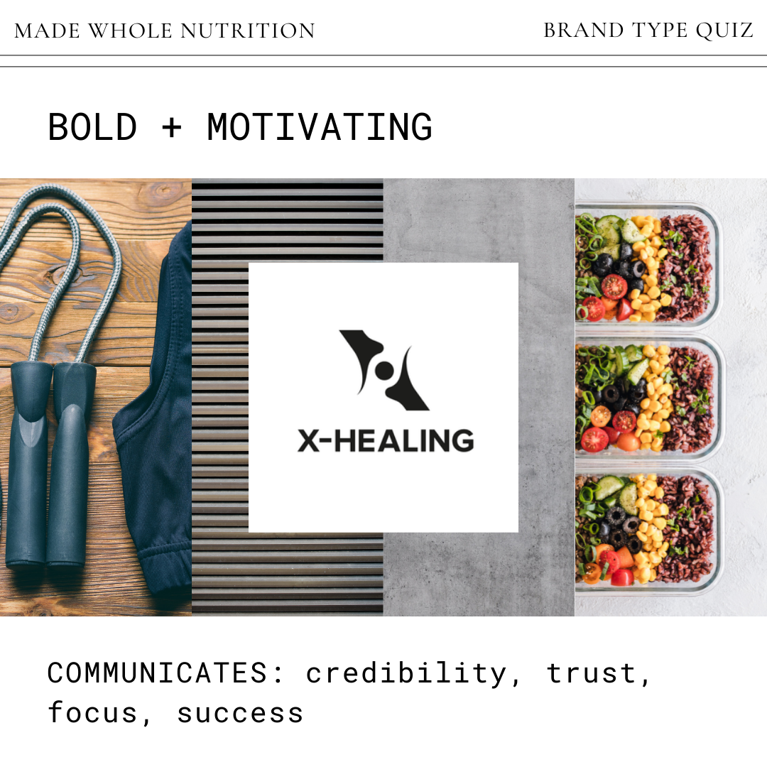
BOLD + MOTIVATING
colors: distinct and bright OR black and white
elements: distinct
font: distinct (did I mention that this aesthetic is distinct?)
best for: a practice focused on coaching, motivation, and results (perhaps incorporating fitness too)
pros: communicates credibility, trust, focus, and success
cons: can come across as harsh or intimidating
how to set apart: consider using a softer accent color or a serif font to balance out the other bold elements
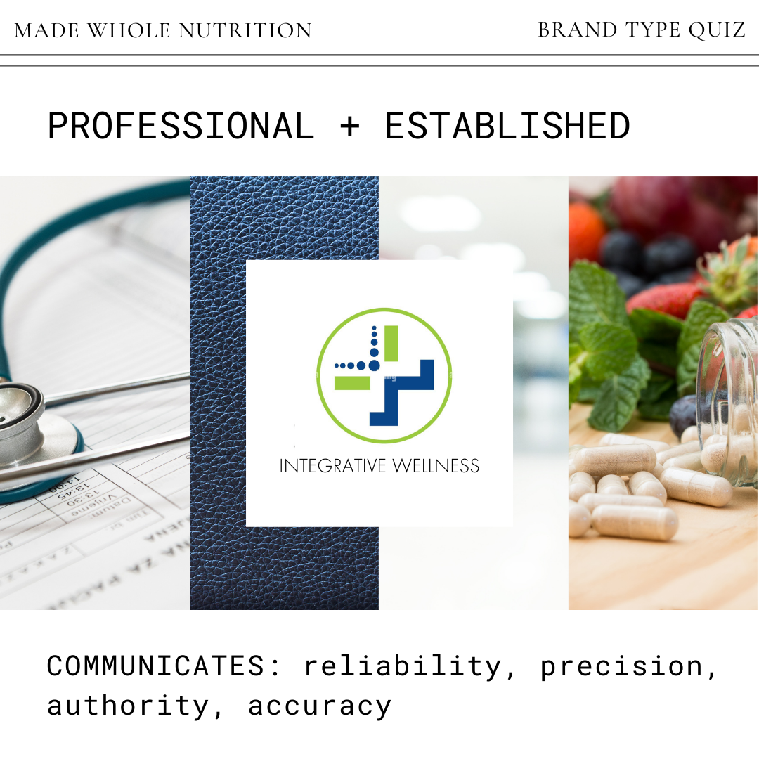
PROFESSIONAL + ESTABLISHED
colors: blue, green, purple (most commonly used colors in medicine)
elements: modern shape or design
font: clean and non-assuming
best for: a practice that focuses on lab testing or integrative medicine to guide patient protocols
pros: communicates reliability, precision, authority, and credibility
cons: can look “biotechy” and impersonal
how to set apart: distinguish your practice by ensuring your logo contains a word or image that indicates that this is not another medical clinic (like a leaf or word like “functional, integrative, holistic, etc”)
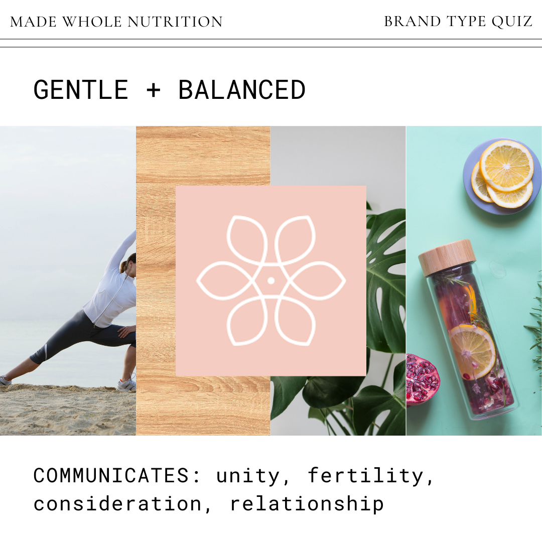
GENTLE + BALANCED
colors: pink, purple, white, tan, or gray
elements: flowers, leaves, circles (a symbol for unity)
font: maybe scripts (but be careful, more scrolls look more outdated so find one that is more simple and modern)
best for: a practice that focuses on women's health, hormones, fertility, etc
pros: communicates unity, fertility, consideration, and relationship
cons: may be mistaken for a fancy soap business
how to set apart: combine soft elements with others that communicate strength (bold font, shape with sharper edges, dark color)